This review focuses on business productivity with the Amazon Fire Phone.
TLDR Version: Fire Phone’s stock apps for Email, Contacts, Calendar, and Tasks are amateurish when compared to Galaxy S5. A shadow behind every text heading that changes dynamically with phone movements will annoy business users. The 3D Dynamic Perspective feature, while cool, distracts from flat-design principles the mobile industry is pivoting to.
One clever feature on Fire Phone is snippets on the homescreen. You can see 2-3 recent emails on the homescreen. This snippet area is app-specific, so useful snippets show on the homescreen for every app. Saves a lot of time.
Fire Phone packs new software and visuals but lacks the streamlined experience business users expect from $200 phones like Samsung or HTC. Future versions of Fire Phone will, undoubtedly, arrive more polished. Hat tip to Amazon for foraying into competitive territory and establishing their unique mark based on software.
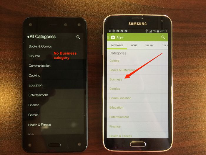
While the Appstore has categories, it fails to include a category for Business. Huh? Android historians will recall early versions of Android Market (now Google Play Store) also lacked a Business category. Perhaps this will come with time.

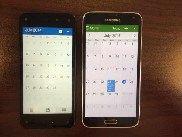
Fire Phone’s stock calendar app is sleek and mirrors the Galaxy S5. The one drawback in Month view is that you cannot determine how many appointments you have for a given day without tapping on the day and entering Day view. On GS5, each appointment comes with a snippet so you know at a glance how busy your day is.


Both devices have common appointment fields like Start/End times, Location, and Attendees. The GS5 lets you select Timezone, which might be important to travel warriors.
Also, the Location field on GS5 has a Google Maps icon that lets you use a map to pick a location. Fire Phone’s Location field is text entry.
Fire Phone has a clever homescreen snippets feature that shows your latest email messages. Because Fire Phone use a carousel theme on the homescreen, they use the space below the app icon to show you snippets related to your app. The carousel for Settings, for example, will show you popular settings.
Fire Phone’s email app borrows font-styling from iOS and is better than most stock Samsung or HTC mail apps. I was able to set up my Outlook.com account in seconds. ActiveSync accounts are fully supported, as this BusinessInsider article confirms.
Swipe on the left edge of the homescreen on Fire Phone and a convenient slider emerges. You can access popular features of your phone right from this menu. What kills the experience is the 3D texture behind the letters. As you can see from this image, it adds a subtle layer of “blur” around the text which may drive business users nuts.
Fire Phone’s personal help feature works. I was able to get “Steven” online with me in less than 30 seconds. During the wait, a message reassures me that Mayday only shares my screen and not anything through my forward-facing camera.
The reaction from the business community will be interesting to monitor. On one hand Mayday is a lifesaver for professionals who need to fix something immediately. On another hand, being one-click away from someone viewing what’s on your screen may be troubling. You decide.
Fire Phone v1 is naive for business users. If you like the latest technology and a new spin on software gimmicks, try it out. You might enjoy their fresh approach. If you want a mature Android phone, the Galaxy S5, HTC One, or a similar Android unit earns my $200.
Weight management has become particularly relevant, requiring a systematic approach and professional support. Digital technologies…
A dedicated screening layer empowers teams to focus on community growth rather than endless manual…
The 2025 IRS mileage rate is a delivery driver’s best friend when it comes to…
Effective debt recovery is within reach for businesses that use the right tools and have…
Buying decisions follow predictable patterns. Messages about limited availability, social proof, and smart pricing make…
The last thing you probably want to add to your plate is stressing over cybersecurity…