Welcome to part 3 of 4 in our mini-series that explains in greater detail some of the new features in DejaOffice 1.10.6 for Android. Be sure to read part 1 (widgets) and part 2 (global search) as well!
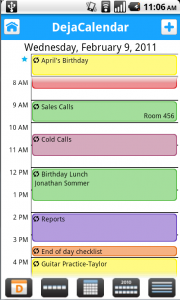
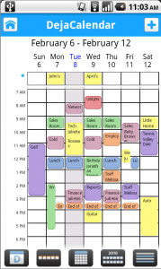
If you’ve been a longtime user of DejaOffice, you’re bound to appreciate the improvements we’ve made on the look and feel of DejaCal. With a refreshed UI, we feel the calendar is more efficient and better looking than ever! The look and feel is not the only change we’ve brought to DejaCal, however. We have also introduced a PalmOS style date picker.
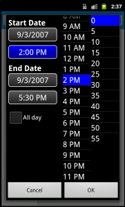
The new PalmOS style date picker is sure to be a hit. While Android has many great features, allowing you to quickly pick the date and time for an event is not its strongest one. That’s why we rebuilt the date picker for DejaOffice. If you’ve used a PalmOS device in the past, you’ll find this looks familiar. With this new format, you’re able to quickly select a date and time and move on. When it comes to mobile productivity, accomplishing something in the fewest possible steps is important. We think the newly designed date picker goes a long way in doing just that!
Tomorrow, I’ll wrap up this series of updates with a post on how we’ve implemented recurring tasks, and how you can best use them!


