This week we are releasing changes to DejaOffice PC CRM. A focus of these changes are to lower the number of keystrokes needed to create Calendar Events and Tasks, and to better utilize space on the Contact View Screen.
This set of changes is dubbed “2020”. For all of these changes you can revert to the 2019 screens by going to Settings, and then selecting Contacts, Calendar or Tasks, and choosing the option to use 2019 screen formats.
Calendar Edit
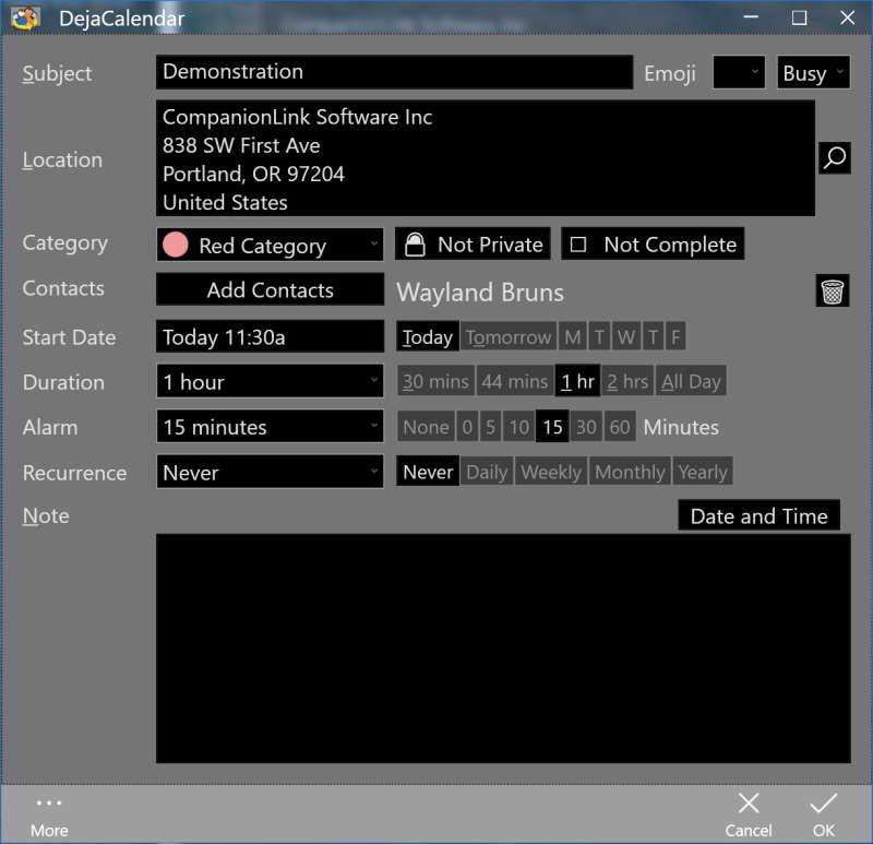
When creating an event, we have moved location higher, and condensed some of the options for private and complete. Most notably we have added “quick select” buttons for most common appointment times.

If you choose to make an appointment for a future day, for instance choose “T” for Tuesday – the appointment will automatically slot to your next available time on Tuesday. If there is no slot, a message will show for the Conflict. The system is always trying to slot you for the future. If you click “T” on Tuesday, it will be for the following week on Tuesday. If you click on “Today” it will be for later today.
Task Edit
The Task Edit screen largely follows the changes on Calendar Edit
Contact View
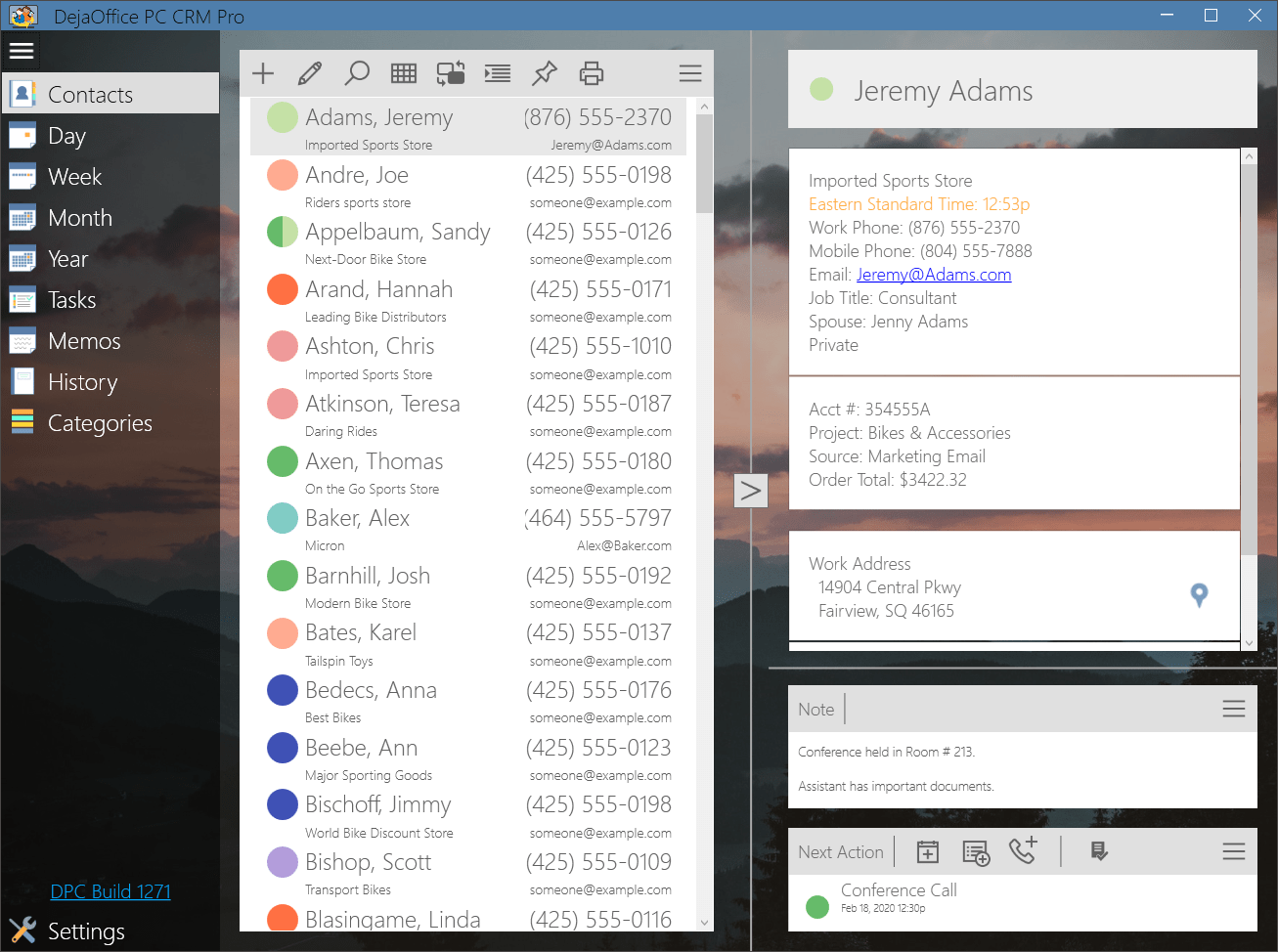
Our goal With Contact View is to get more info into the available screens space. For our Palm Desktop customers, this has not been an issue, because the screen can easily display Contact info, Phone Numbers, Custom Fields and Notes. For our CRM Customers, however, the view area is both crowded and also forced you to scroll to see important information. There was no way to view History, Notes, and Custom Fields without scrolling up and down.
Our solution is to reset the field display if you give it enough width:


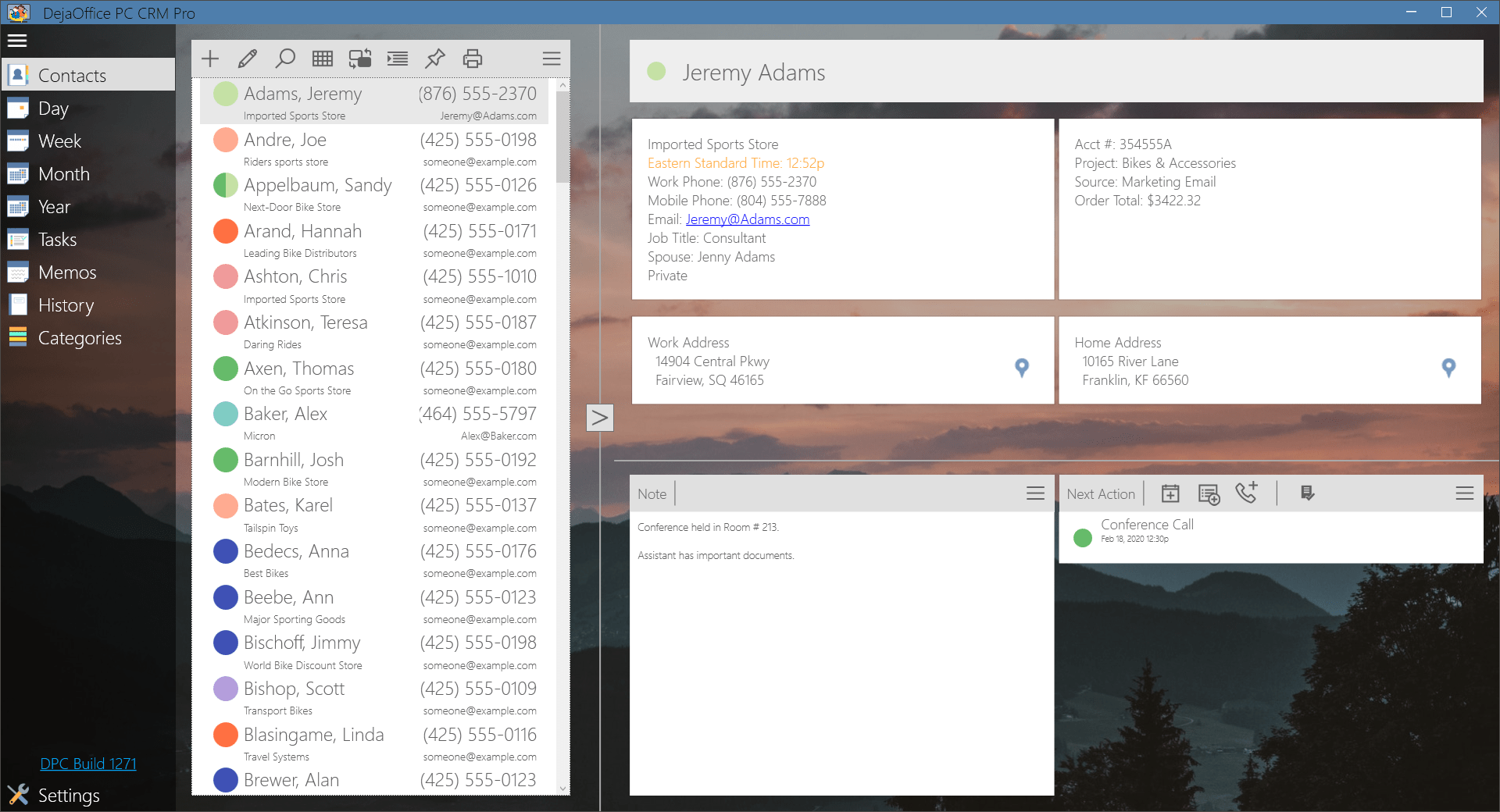
If you make the View Panel wider, it will automatically reset to a two-column format. This allows notes to show beside the Histories, and allows addresses to appear side-by-side.
For our CRM users, we recommend you keep the screen expanded as much as possible, and this will reduce the need to scroll.
Unique Capability
With the expanded view – DejaOffice offers something unique in the CRM world – the ability to see both your notes and your history at the same time. Nearly all competing products use tabs, so you can see notes or history, but not both.
New Edit Modes for Contact Screen
We have added context sensitive editing. So if you click on an Address, it will go to the Address Edit view. If you click on the Custom Fields, it will go to the custom fields edit. If you click on the Notes Header it will go to the larger note edit screen, while clicking on the Notes Body will let you edit in the existing view frame.
Detail feature guide: Here is a Guide for our new 2020 Edit Screens.
Thank you for using DejaOffice!