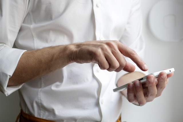
Push notifications are indispensable elements of every mobile app nowadays. They bring value to users by allowing them to access information from the app without the need to check it constantly, while for businesses notifications provide powerful marketing and selling opportunities.
By understanding the principle of perception and what goes on in a user’s mind, you can adapt to it and turn mobile push campaigns into something relevant and exciting. In this post, you will find useful advice for the UX/UI design of mobile push notifications to improve overall performance.

What is a Push Notification?
Push notifications are messages that are sent to your device from a website (if you use a desktop) or mobile application (now more common).
To receive push notifications, the user has to become a subscriber and click on the “Allow” button in the browser service window, which appears automatically.
Such notifications solve a lot of important tasks, such as:
- Allowing you to quickly return visitors to the site; for example, to complete a purchase or registration
- Form the brand image and spread the knowledge about the company and its product
- Allowing the business to send individual messages and alerts for certain target groups, which increases the conversion to purchase.
Notifications stimulate sales by informing users about promotions, releases of new products, discounts, and bonuses.
What industries typically use them?
- Media
- Ecommerce
- Games
- Carriers
- Financial institutions
- Travel companies, and many others
Push-mailing helps to get closer to the user based on mutual interest and, consequently, provide better, more individualized service.
Push Notifications: The Basics
Push notifications are not an independent tool but part of a smart marketing/content strategy. In order for it to be successful, the UX/UI designer has to respect the following principles:
Offer Something Valuable
Why does the client need your push notifications? The main thing is that the user sees the point of receiving notifications.
Visualize
A notification with images and videos brings the story better than plain text, as it affects emotions more. For instance, if you offer a sale item, add a photo of it.
Personalize
A mobile phone is a personal device. When you bring something directly to a person through the mobile interface, use the client’s name or at least take into account the latest actions of the user to imitate live communication.
Top Tips for Better Push Notifications
By using the design features to the maximum, you can create attractive messages that will captivate your audience and encourage interaction, instead of just brushing off an irrelevant push. Consider what is needed to do this.
1. Be Laconic
It is generally not recommended to create messages that are longer than 40-50 characters since the message will be displayed differently across various devices. Also, by sending push notifications to people’s phones, you will most likely catch them in the middle of something. The majority of them will not get distracted by reading a long message until the end.
2. Use Emojis
According to a study conducted by App Annie, push emoticons to boost the open rate twice as much as the one of a push without any emoji. Increase campaign performance with content that resonates emotionally. It also pushes users to click. However, insert emojis only where relevant. Also, it is better to add them at the end of a sentence or a separate phrase.

3. Visualize
A push notification with an image attracts attention and can convey more information. Reinforce your push campaigns with banners and images. It should be remembered that the screen size depends on the model of the device. Some services allow you to preview notifications.
4. Encourage button interaction
Give subscribers a choice: add a few buttons with call-to-actions that they can click on. Interactivity is the key to sales and a positive brand image. Also, it is just good UX/UI when the users can access the functionality of an application directly from the push.
5. Use links
By default, clicking on the mobile push notification initiates the application’s opening. But it’s much more convenient when you click on the push to apply a promotional code or open a section with a specific promotion.
Current mobile applications are capable of generating a link to a page of any content. Links that open the desired section of the application are called dip-links. Use these to save your users from having to search for the specific page themselves.
Conclusion
By following these UX/UI tips, you will be able to generate push notifications that correlate with the interest of both the business and their customers. Try to bring value to the user and provide comfortable solutions in your design, and the results will come fast.