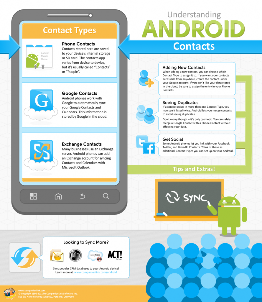
Confused about how Android Contacts and Accounts work? We’ve created an infographic that helps explain the chaos!
Update: Now that Motorola’s DROID RAZR and Samsung’s Galaxy Nexus (featuring the next generation of Android – Ice Cream Sandwich) have been announced, this infographic is even more relevant. These two phones are sure to draw many users over to Android for the first time!
Coming to Android from a “feature phone,” a BlackBerry, or even iOS, there are a number of new features to get used to. One aspect that we’ve seen a lot of uncertainty about is exactly how Contacts work on Android.
As such, we’ve created an infographic to help visualize how Android Contacts work and hopefully eliminate some of the confusion. Check it out below:
(Click the graphic for a larger version)
Understanding Android Contacts [Infographic] was last modified: October 19th, 2011 by David Z
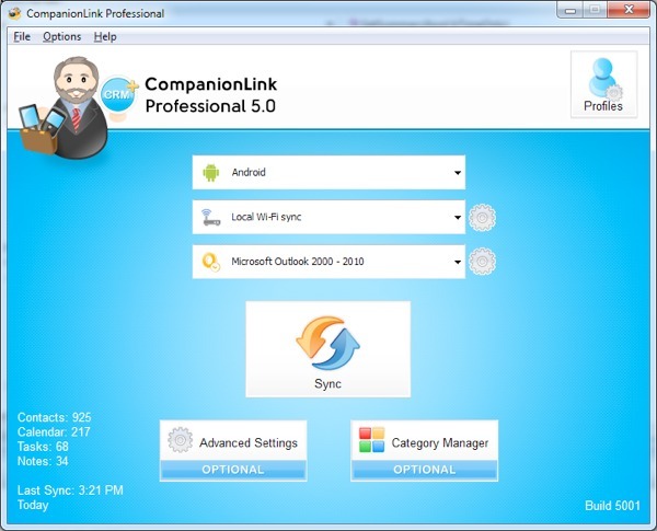
As of today, CompanionLink 5 is officially out of beta!
If you haven’t already heard what’s new, head over to our blog post announcing the beta to read all about it, but know that you can expect the following:
– A completely redesigned interface
– New setup wizards to help you configure a reliable sync process
– Multiple device profiles in CompanionLink Express
– CompanionLink Professional now allows up to 5 profiles
– Support for the latest CRM software and mobile OS’s
– Numerous bug fixes and sync improvements
Prices start at $14.95. We have discounted upgrades for existing customers. Visit our storefront and click on the blue Upgrade button next to the product you want to upgrade to.
CompanionLink 5 Launches Today was last modified: October 11th, 2012 by David Z
Sprint has officially begun selling the Galaxy S II, which marks the beginning of the phone’s entry into the US. It has been wildly popular in Europe over the past few months, and with the specs that it has it’s no real surprise! While Sprint has been the first major carrier to carry the device in the US, AT&T and T-Mobile are set to follow shortly, though the exact dates are unknown.
Take a look at our video below to learn a bit about each of the unique variants of the Galaxy S II and hear our thoughts on whether this phone is worth the upgrade!
It’s been 9 months in the making, but the DROID BIONIC is finally here. It was first seen back in January, but delays, rumors of cancellation, and more delays have caused the BIONIC to become one of the most hyped phones this year. And based on its specs, Motorola is hoping to deliver on that hype.
It is no doubt a powerhouse, something the specs, and the price, reflect. The BIONIC features a 4.3” qHD touchscreen display, dual-core 1GHz processor, 1GB RAM, 16GB internal storage with a 16GB microSD card preinstalled, 8 megapixel camera, and much more. Running on Verizon’s 4G network, the BIONIC is listed at $299 with a new 2-year contract.
It’s place among the top Android phones is without question, but does it live up to the hype? Hear our thoughts in the video below:
[youtube=https://www.youtube.com/watch?v=gFzTb6nEOOY]
As you can see, we got our hands on the BIONIC and are happy to report that CompanionLink will allow you to sync the BIONIC with Outlook, ACT!, Salesforce, and more! Contacts, calendars, tasks, memos and more all sync seamlessly. Try it for yourself with our 14-day free trial or grab a copy of CompanionLink today. Prices start at just $49.95.
What do you think of the BIONIC? Do you have questions about syncing? Leave a comment below!
The DROID BIONIC Has Landed – Now Sync It With Outlook & More was last modified: September 8th, 2011 by David Z
Planning on getting one of the new BlackBerry 7 devices that were released this past weekend? I have good news – CompanionLink works great with each of them!
That’s right – the BlackBerry Bold 9930, BlackBerry Torch 9850, and BlackBerry Torch 9810 are all fully compatible with CompanionLink’s current sync options for BlackBerry. Whether you want USB sync via BlackBerry Desktop, basic wireless sync via Google, or advanced wireless sync via CompanionLink Secure Hosted, we’ve got you covered.
Tablets won’t be replacing computers any time soon.
At least according to a recent study by Robert W. Baird & Co. 83% of consumers surveyed said that they could not do without a computer for the foreseeable future. According to consumers, tablets are cool. They’re fun. They’re wildly popular. But, for the majority of users, they simply cannot replace a computer. Not in their current form, anyways.
When compared to a tablet or smartphone, what is it that makes the PC so indispensable to the vast majority of the population? It’s not a keyboard or mouse – tablets can accommodate traditional input devices such as these already. It’s not power. Well, not for most users anyways. Today’s tablets and smartphones can easily handle the average users’ needs. For those that need more, it’s only a matter of time before mobile devices catch up to traditional PCs in terms of processing power, RAM, graphics, and storage. So if it isn’t these things, what is it?
In my opinion, it comes down to the form factor and operating system. Tablets and smartphones are great on the go, but it’s hard to beat a 24” screen with a “desktop-optimized” operating system when you’re at the office or at home. If that’s the case, why can’t tablets and smartphones offer these features as well? They can.
We’ve said it before – computers as we know them are going extinct. Devices like the Motorola Atrix and the Asus Transformer already offer tools for attaining the “desktop experience” from your mobile. Soon, many more mobile devices will offer the ability to dock to the traditional monitor, keyboard, and mouse setup. Your “computer” will actually be just a shell powered by your mobile device.
So 83% of consumers are in luck – they won’t have to go without a computer in the foreseeable future. What they may not realize, however, is that their computer will, in fact, be a tablet or smartphone.
Study Shows Computers Are Here To Stay – But Are They Really? was last modified: February 12th, 2024 by David Z
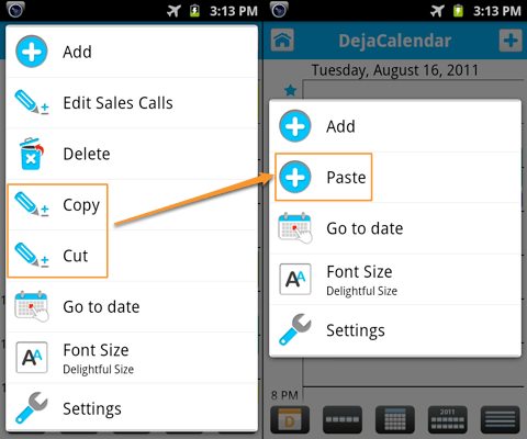
DejaOffice 1.12 beta brought a big new feature to our Android app: time zone support. That’s not the only big news, however. We’ve also introduced a feature that many of you have been asking for recently: the ability to copy and paste events in DejaCalendar.
Copying and pasting events works just like you’d expect. In the day view or week view, just tap and hold (long press) on an event to bring up the context menu. Then, select “Copy” or “Cut.” Next, navigate to the day/week you want to move it to, tap and hold in a blank calendar space near the time you want, and select “Paste” from the context menu. It’s that easy!
Can’t wait to try this out? Head over to the DejaOffice website to download the latest Android beta. Have any other ideas for us on how to make DejaOffice better? Let us know!
Copy and Paste Events With DejaOffice 1.12 for Android was last modified: October 7th, 2011 by David Z
We’ve talked about dealing with duplicates before on the blog, but today I wanted to share with you a video we just published on the topic. In this quick video, we’ll show you step-by-step how to remove duplicates using CompanionLink – and how to avoid them in the first place!
I’m happy to share that we’ve passed 100,000 active installs of DejaOffice! That means that amongst you, our customers, there are over 100,000 Android phones & tablets, iPhones, iPads, and iPod Touches all over the world currently being enhanced by DejaOffice’s business-class productivity features. All this in just a little over one year, too!
2011 has already been an exciting year for DejaOffice. We’ve added dozens of new features and enhancements, from widgets to global search to grouping, and much more. But we’re not stopping there. We have even more great features planned. While I can’t get into the details just yet, I can tell you that 2011 will continue to be a very exciting year for DejaOffice. Stay tuned!
DejaOffice Flies Past 100,000 Active Installs was last modified: June 21st, 2011 by David Z
If you’ve been searching for an online CRM solution, there’s no doubt you’ve come across both Zoho and Salesforce. Initially, they are hard to compare – the pricing is vastly different and neither of them offer any sort of comparison chart. After some research, however, you’ll begin to notice some clear similarities and differences.
As far as the basic components of CRM are concerned, both Zoho and Salesforce offer what any user will need. Accounts, contacts, campaigns, Outlook and Office integration, collaboration tools, etc. are found in both services. And, of course, CompanionLink works great with either Zoho or Salesforce! So how do you decide which is right for you? Let us help by highlighting the unique benefits each service offers.
Zoho: Affordable, Quick, Easy
The most obvious benefit Zoho has to offer is its pricing. At $12 or $25 per user per month, it’s $100 less than Salesforce’s most popular offering. Zoho even offers a free version for users who need a very simple CRM solution.
Of course, price isn’t the only benefit Zoho offers. Zoho is designed to be quick and easy, allowing even the smallest businesses to jump in and get started right away. Zoho also offers integration with their complete suite of Zoho Apps, providing access to chat, docs, invoicing, projects, meetings, and much more.
In the end, you’ll want to look into Zoho if you’re a small to medium business looking for a full-featured, yet affordable CRM solution.
Salesforce: Powerful, Customizable, Expandable
Salesforce generally gets accused of being more expensive than Zoho or other CRM options. With its most popular edition going for $125 per user per month, this may seem to be the case. However, Salesforce accounts start at just $5 per user per month for their more basic CRM solution.
That said, most users generally opt for one of the higher priced plans. The question then becomes, “What do I get for my money?” In addition to all the benefits you’d expect from a CRM service, Salesforce offers the ability to customize your experience via custom apps and websites, a developer sandbox, and integration via a web services API. All that may sound a bit technical, but it essentially means that, with a little technical know-how, you can make Salesforce do exactly what you need it to do for your specific setup. To make customization even easier, Salesforce hosts a cloud-computing marketplace called AppExchange where you can find over 1,000 different apps that will help make Salesforce work for your setup!
Generally speaking, if you’re a medium to large business with custom CRM needs, Salesforce is a great option.
Hopefully this has helped narrow your search. In our experience, there isn’t a bad choice here.
Zoho vs. Salesforce – A Quick Guide on How to Decide was last modified: May 20th, 2011 by David Z
Creating a category called “Personal” allows you to keep your home life organized in its own section of your database. Your complete database is on your device, but it’s easily sorted so that you only see the data that is relevant to your current situation.
Unfortunately, not all devices have category functionality, and those that do are often limited. To remedy this, DejaOffice allows you to create and manage categories, as well as assign colors to them to further differentiate your data. This exponentially boosts productivity, especially once you begin to use colors to cue yourself for the urgency or types of tasks. Red means must-do and urgent. Yellow means phone calls. Orange means it’s not the end of the world if you miss this appointment or meeting. And so on. At a glance, you will be able to know how many urgent meetings, calls, etc., you have on any given day.
Taking this a step further, you can then use CompanionLink’s sync software to sync your phone to your PC. CompanionLink gives you the option to ignore your personal contacts during sync. This allows you to keep your work data up to date in programs like Outlook, ACT, and more without mixing in personal data on a work computer.
So, with a little help from DejaOffice and CompanionLink, you’ll be down to just one phone all while keeping your work data synced and personal data separated!
How To Keep Your Personal Data Separated From Your Work Life was last modified: April 22nd, 2011 by David Z
Google recently announced complete integration between Google Voice and Sprint phone numbers. In my opinion, this is huge news. Sprint customers will be able to link their number to Google Voice and instantly take advantage of all the great features that Google Voice offers. This all works seamlessly, without requiring an app of any kind on the phone.
As a Sprint customer using Google Voice, you’ll be able to forward calls to other phones, take advantage of voicemail transcriptions, send (and archive) texts online, make calls from your Sprint number via Gmail, and more. Having such easy and ubiquitous access to your call history, text messages, voicemail, and more can be a huge productivity boon. For some time now our phones have been able to augment our computer use. It’s about time our computers truly do the same for our phone use!
If you’re a Sprint customer ready to integrate with Google Voice, head over to https://www.google.com/googlevoice/sprint/ to get started. If you’re on one of the other networks (like myself), well, you’ll have to wait patiently and hope that the other carriers follow suit!
Why All Sprint Customers Should Go Sign Up For Google Voice was last modified: February 12th, 2024 by David Z
By now, you’ve no doubt seen countless reviews and comparisons of the Motorola Xoom and Apple iPad 2. They talk about the size, the weight, the features, etc. and post galleries of images and embedded software development for your viewing pleasure. By all means, they are certainly providing helpful information.
That said, I want to compare the two from a productivity standpoint. I want to take a look at the two devices and answer the following question: Which device will allow you to be more productive while on the go?
In order to accomplish this, I’ll be looking at three distinct areas:
1. Tech Specs: Battery life, speed, screen size, etc
2. Usability: Interface design, intuitiveness, etc
3. Compatibility & Expandability: Will it work with my system?
Tech Specs:
The Xoom and iPad 2 aren’t drastically different when it comes to hardware. Both devices have a screen size of ~10” (though the Xoom has a higher resolution), both are running dual-core 1GHz processors, both have front & rear facing cameras, both feature batteries that will last all day, and both share similar dimensions & weight. When it comes down to it, neither device is especially better than the other in terms of tech specs. The Xoom’s screen resolution is a bit higher, its cameras are a bit better, and it will soon support 4G speeds and Adobe Flash. The iPad 2 is thinner, lighter, has higher built-in storage options, sells for less money, and is available on multiple networks.
The Verdict: From a technical specification standpoint, the devices are quite similar when considering mobile productivity. They both offer large screens, they’re both quite portable, and they both have plenty of power to run your mobile office. Everything else aside, it really comes down to personal preference.
Usability:
I am quite impressed with how far Android has come lately. Many of the features found in Android 3.0 are impressive, and the level of customization the device allows is great. Widgets offer at-a-glance information, the freedom to arrange home screens at will allows better organization. Overall, with a small investment of time, the Xoom can be setup to make you extremely efficient on the go. However, it feels surprisingly slow when compared to iOS 4.3 on the iPad 2 – and that’s saying something. I would never have called the Xoom slow before, but setting them side by side shows just how well Apple has optimized their iOS to take advantage of the hardware.
The iPad 2 does not introduce many new features when it comes to usability, but rather optimizes existing ones. Everything feels even faster than before. Anything that involved more intensive graphics power simply screamed on the iPad. Early testing seems to agree that the iPad 2 is around 2x faster than the Xoom when it comes to graphics power. As a result, everything the iPad does quickly it does beautifully as well, with smooth animations and transitions. It is clear that Apple has invested a lot of time perfecting the experience. This unique experience often translates into a higher level of productivity.
The Verdict: It’s a close call, again. Many users will prefer the level of customization and organization that the Xoom offers. Being highly organized is a crucial part of being productive on the go. On the other hand, the speed that the iPad 2 manages to handle everything you throw at it easily makes up for its more basic organization options.
Compatibility:
Android sets up via Google. iOS, via iTunes. The different setups mean different levels of compatibility, whether with other devices or programs. That said, it’s the apps that can make all the difference.
The iPad 2 supports all existing iOS apps right out of the box. Essentially, if your setup works on an iPhone, iPad 1, or iPod Touch, it will work just fine on the iPad 2. The Xoom has a little catching up to do in this area, simply due to the fact that it’s the first tablet with Honeycomb. Since Honeycomb is the first official tablet version of Android, the platform has some catching up to do. That said, existing Android apps work (even if they’re not optimized for the tablet) and, as such, the Xoom supports most existing Android solutions.
At the end of the day, the more popular solutions will work just fine. For example, DejaOffice works great on both the iPad 2 and the Xoom. A quick install of the app is all it takes to start getting all your contacts, calendars, tasks, and memos over to the tablet.
The Verdict: The iPad 2 wins when it comes to sheer numbers, but the Xoom and Android are quickly catching up.
So Where Does This Leave Us?
It’s actually a close call. Both the Xoom and the iPad 2 have their strengths. So what tablet should you get? Ultimately, the decision is up to you, but in my opinion the winner is the iPad 2. The Xoom is a great product with its powerful customization options and 4G data speeds, and Android 3.0 will only continue to get better. However, I’d have to say that overall the iPad 2 is simply the best tablet currently available. With it’s incredible speed, sleek Apple design, lightweight form factor, and intuitive UI, it has set the bar high for mobile productivity in the tablet market and has left competitors playing catch-up.
Of course, that’s my opinion – I’d love to hear yours in the comments!
Tablet Faceoff: Motorola’s Xoom vs. Apple’s iPad 2 was last modified: December 22nd, 2020 by David Z
Recently, DejaOffice was featured on the IT Management blog Datamation for being among the top 50 free iPad apps for business. We’re thrilled to be on this list, and I recommend you read through it as there are quite a few great apps mentioned! Reading over the article myself, I started thinking about just how far mobile computing has come and where it is heading.
The iPad, for example, offers access to thousands of apps while maintaining an ultra-portable form factor and featuring intuitive touchscreen inputs. As such, I believe that tablets are signaling a paradigm shift for mobile productivity. In my own use, I have found myself using the iPad for things I used to do on the computer or avoided doing on my smaller smartphone screen. For example, if I need to edit or review a document while I am on the go I can simply open it on the iPad, make any necessary comments or edits, and e-mail it off. I am generally able to interact with my iPad more quickly and efficiently than with my smartphone, making me more productive while mobile. I could go on, but the point is simple: I now have a device that gives me the power I need with the mobility I want.
What’s more amazing, however, is the fact that a device like the iPad has only been out for one year. Think about just how far cell phones have come in the last 5 years. If cell phone technology has advanced that far in a few years, just imagine where tablets will go! It is truly an exciting future to think about.
The Future of Mobile Computing was last modified: February 18th, 2011 by David Z